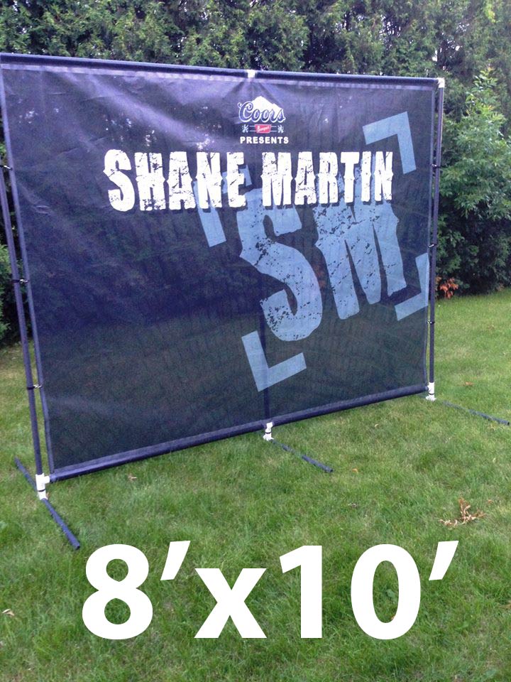
How To Design Stage Backdrops That Look Great On Stage
Every great stage backdrop does one thing REALLY well: The design pops in your audience’s eyes.
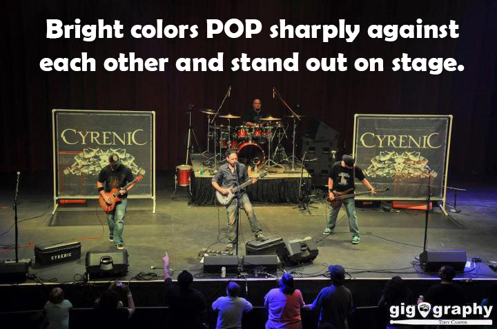
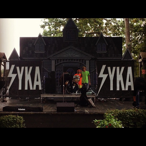
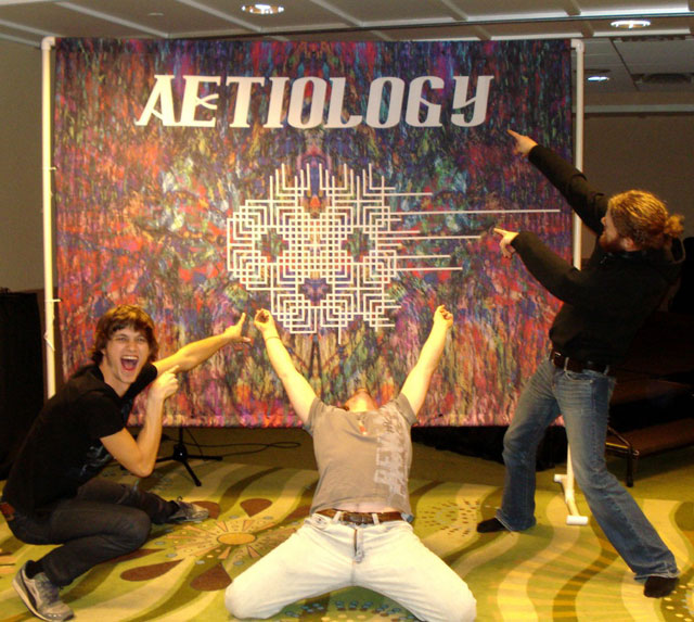
When you start working with a graphic designer on your artwork for your stage banner, remember this essential rule: Your design must POP! As a band, you will use your stage backdrop in a wide range of venues, where the lighting will vary from place to place.
In a dark bar, design that pops stands out even with little lighting and moving people. In a venue with good stage lighting, bright designs on a stage banner will look ten times as good as they did on your graphic designer’s computer screen. Here’s how to make sure your band banner design pops:
1. Use bright colors that contrast sharply with each other.
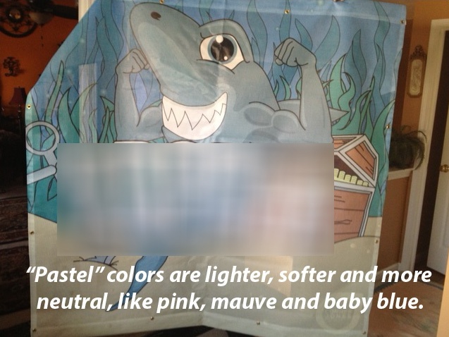
2. At all costs, avoid using soft, pastel colors that blend with each other.
For more information about how to design your stage banners or to order a beautiful backdrop for your band,
email Mendy at mendy@northcoastbanners.com or call me at 734-680-7902.